eBaumsWorld: Funny Videos, Pictures, Soundboards and Jokes
Funny Galleries Funny Videos Games Time Wasters Internet Classics Spicy
eBaumsWorld: Funny Videos, Pictures, Soundboards and Jokes
  • Funny Galleries
  • Funny Videos
  • Games
  • Time Wasters
  • Internet Classics
  • Spicy
Funny GalleriesFunny VideosSpicyGamesTime WastersInternet Classics

25 Infographs and Charts That Make Data More Relatable

Sometimes it's hard to conceptualize what a bunch of data points really mean. That's why we have graphs, and boy are they beautiful.

By Daniel Bonfiglio

Published 6 months ago in Wow

Sometimes it's hard to conceptualize what a bunch of data points really mean. That's why we have graphs, and boy are they beautiful. The people of r/dataisbeautiful think so anyway and pull no punches sharing their favorite charts and figures. This gallery features some of the best work that the group has to offer; hopefully, you're a visual learner. 


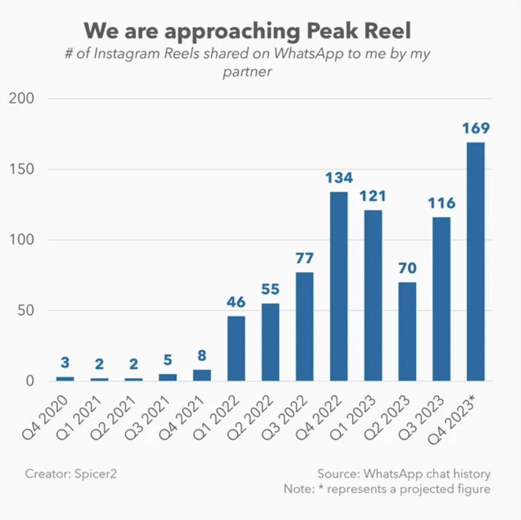
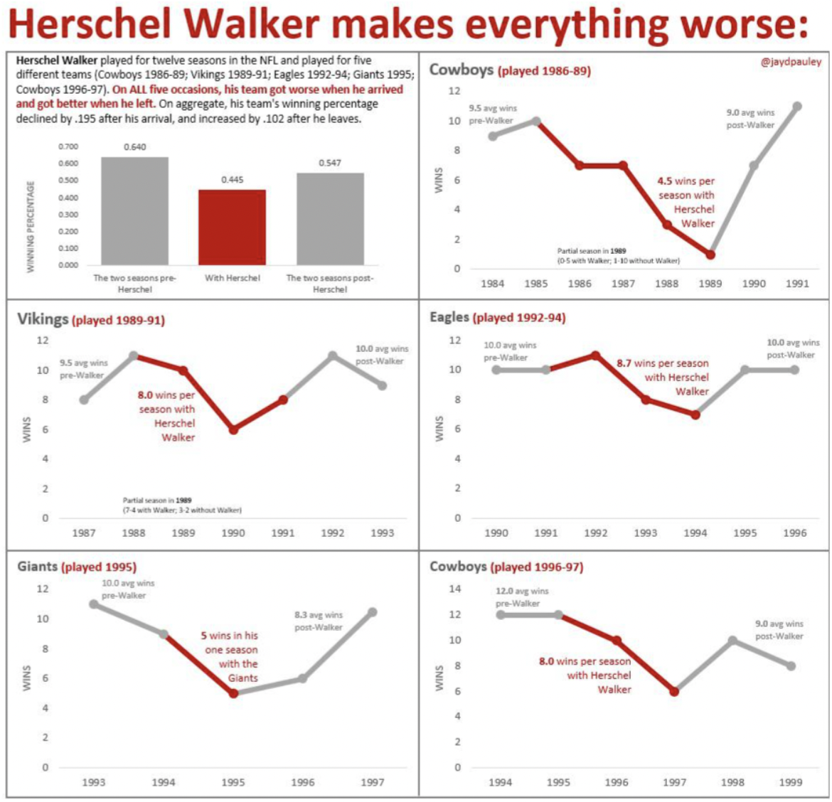
From personal curiosities to critical international studies, these graphs cover a wide variety of topics. One guy even tracked the number of Instagram reels his girlfriend sent him per quarter. My own personal reel frequency depends greatly on whether or not I'm in the bathroom. A different graph implies that the Hall of Fame NFL running back Hershel Walker was actually a big hindrance to every team he was on. Coincidence? The harm of overspending money on one star player, and the recent devaluation of the running back position would say no, regardless of his immense talent. 


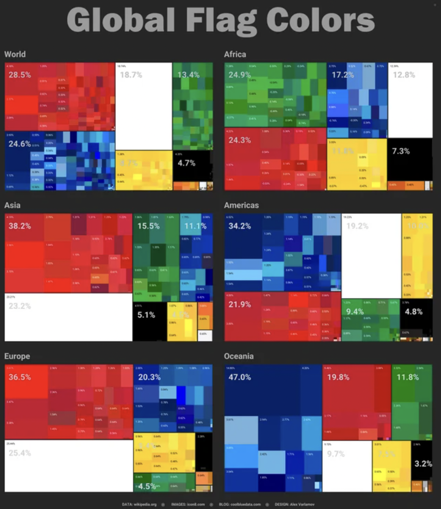
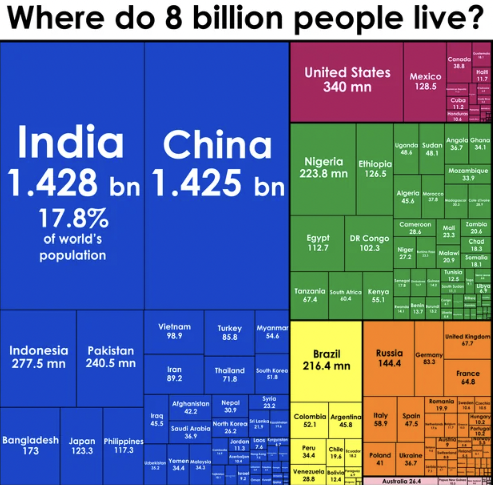
That's why graphs are so useful; they can show us a visual representation of information we might have been hesitant to acknowledge otherwise. For example, I had no idea how large by percentage the populations of India, China, Pakistan, and a few other countries were. The numbers themselves just don't hit the same. That's why we need these beautiful graphs. 

  • 1

    “I tracked the number of Instagram Reels my GF shares with me every quarter.”

    25 Infographs and Charts That Make Data More Relatable

  • 2

    25 Infographs and Charts That Make Data More Relatable

  • 3

    “My 2-month long job search as a Software Engineer with 4 YEO.”

    25 Infographs and Charts That Make Data More Relatable

  • 4

    25 Infographs and Charts That Make Data More Relatable

  • 5

    25 Infographs and Charts That Make Data More Relatable

  • 6

    25 Infographs and Charts That Make Data More Relatable

  • 7

    25 Infographs and Charts That Make Data More Relatable

  • 8

    25 Infographs and Charts That Make Data More Relatable

  • 9

    25 Infographs and Charts That Make Data More Relatable

  • 10

    25 Infographs and Charts That Make Data More Relatable

  • 11

    25 Infographs and Charts That Make Data More Relatable

  • 12

    25 Infographs and Charts That Make Data More Relatable

  • 13

    25 Infographs and Charts That Make Data More Relatable

  • 14

    25 Infographs and Charts That Make Data More Relatable

  • 15

    “Bar chart of the summarized height of all 2x2 LEGO DUPLO bricks my son owns, ordered by color. It's his first bar graph, so please be gentle.

    25 Infographs and Charts That Make Data More Relatable

  • 16

    25 Infographs and Charts That Make Data More Relatable

  • 17

    25 Infographs and Charts That Make Data More Relatable

  • 18

    25 Infographs and Charts That Make Data More Relatable

  • 19

    25 Infographs and Charts That Make Data More Relatable

  • 20

    25 Infographs and Charts That Make Data More Relatable

  • 21

    Size of bank failures since 2000.

    25 Infographs and Charts That Make Data More Relatable

  • 22

    “2.5 years of my GF and I tracking the sleep quality impact of various choices/behaviors. These were the 9 most significant effects. Note - white dash indicates the % effect 5 months ago.

    25 Infographs and Charts That Make Data More Relatable

  • 23

    25 Infographs and Charts That Make Data More Relatable

  • 24

    25 Infographs and Charts That Make Data More Relatable

  • 25

    25 Infographs and Charts That Make Data More Relatable

Categories:

Wow Cool Stuff Facts Trending

Tags:

data beautiful graphs reddit charts ftw
Scroll Down For More


Most Popular

37 Fascinating Pics and Memes to Stay Up Late With

37 Fascinating Pics and Memes to Stay Up Late With

Saturday Morning Randomness: 33 Fun Randoms to Get Back on Track

Saturday Morning Randomness: 33 Fun Randoms to Get Back on Track

31 Things the 'Big-Food' Industry is Purposely Hiding From Us

31 Things the 'Big-Food' Industry is Purposely Hiding From Us


  • About Us
  • Privacy
  • Terms
  • DMCA
  • Contact

If you are the original creator of material featured on this website and want it removed, please contact the webmaster

Copyright© 1998-2025 Literally Media